Good Morning Everybody,
 Wow! What a great kick off we had in Phoenix last night at our first CBTL 2010 stop. The Phoenix photographers are always an enthusiastic group and everyone seemed thrilled with the program.
The highlight of the evening was DOOR PRIZE TIME! We gave away over $6,000 worth of door prizes last night including two registrations to Photoshop World for next year, WPPI and PPA convention registrations, LowePro camera bag, B&H gift cards, canvas gallery wraps, albums, website design, software and so much more!
We gave away 35 door prizes in all – WOW!, that was like a 1in 7 chance in winning - much better odds than Las Vegas, that's for sure. Hey, and we get to do it again in Dallas tonight - Woohoo!
That was the quick tour update - now it's time for today's post. Here we go...
The One That Got Away - Window Light Done Right - Episode 3
Window Light can create some of the most beautiful, softly lit photographs you will can create. The large light source, the window, let's the light wrap around the subject creating very soft edge shadows at the light's transitions from highlight to shadow. That's really the beauty of window light photography.
Remember too, that the light coming in the window needs to be soft. You don't want to stand your subject next to a window with full sun pouring in - you'll get a pretty lousy result if you do.
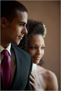
The other important aspect of a beautiful window light portrait is how you bring the subjects together for the shot. Take a look at the following photograph.
 The photographer used the window light beautifully to illuminate the subjects, but the shot is a near miss because of the positioning of the couple relative to each other. Let's first look at the positive aspects of this image and then see what we could have done to improve the photograph and then hit it out of the park.
What's looking good:
1- The groom has very nice light on his face. In his profile view, the photographer positioned him perfectly for a very nice loop lighting pattern on his face. Notice too how the light wraps around his face even filling the shadows.
2- The bride is positioned in mostly a 2/3's view which is quite flattering to her. Since she is in a 2/3's view and the light is coming in from the same direction as the light falling on the groom, the light on her face is more of the Rembrandt variety in which the nose shadow touches the cheek shadow. Not traditionally my favorite lighting pattern but in this case I find it to be quite flattering to the bride.
3- We've got great lighting and great expressions on both the bride and groom. This image is on it's way to being a great portrait.
So where did things go slightly awry? Here is what I would have done to improve the portrait.
Hit the "Read more..." link below for the rest of the story.
1- The first and most important thing to do to improve this portrait is to have the heads of the couple in the proper position relative to each other. See how low the bride's face is relative to the groom. He needs to be lower or she needs to be higher.
The rule of thumb for these types of portraits is to have the eyes of the bride be at about the same level as the mouth of the groom. Or said differently have the person's eyes in the background either slightly above or slightly below the subject in the foreground. She is way too low in this image.
2- Another item that bugs me is the fact that the bride is just too much out of focus or too soft in this image. Had the bride been looking back at the groom, I might have been able to live with the super soft focus. But, since she is also looking out the window, our attention is drawn to her face too. She is soooo out of focus that, it is a bit disconcerting to view the image.
3- Above, I mentioned that the bride was in a "mostly" 2/3's view. mostly meaning that her head is turned just a bit too far past the 2/3's view. See how the far eye is NOT contained by the far side of the face - the far eye always needs to be framed up by the face to flatter the subject.
4- Also notice that the bride's eyes are pulled a bit too far to her left. I see too much of the whites of her eyes from the camera position. The eyes need to be centered from camera position. The photographer just needed to ask her to turn her eyes slightly to her right.
5- Notice too the straight vertical line on the groom's left arm. I want to move his arm slightly forward to create a diagonal line from his shoulder to his elbow. That will create a much nice line as the bride rests her hand on his arm.
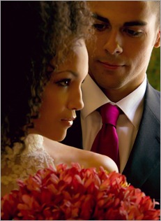
Simple little things that add up to making this image a slight miss. Take a look at this next image.
 This is a shot I made of the same couple but with the groom in the background. It is very similar to the image we have been discussing. Notice how all the points I discussed in this post come together into a very beautiful portrait of the couple.
Again, it the small things that count when you are trying to make your clients look good. But those small things can add up to one fine, great looking portrait!
_________________________________________________________
Hey gang, that's it for me today. We had a super early wake-up call and need to be at the airport for an 8:30 a.m. flight to Dallas. We have our biggest crowd of the week in Dallas this evening - over 300 strong! The Dallas photographers are another wonderful group and we are looking forward to our visit with them this evening.
Don't forget to check back tomorrow for another jammed packed Business Day Thursday. It's a very hot topic and I can't wait for you to read it. Tomorrows post has a great money making idea for you.
Sooooooo..... I'll see you then,
-David

Great info. Thank you!
ReplyDelete